
The colors chosen for an office environment do more than simply decorate the space—they play a significant role in shaping employee mood, productivity, and even company culture. Understanding office buildout color psychology is essential for anyone involved in planning or renovating a workplace. Strategic color selection can influence focus, reduce stress, and foster collaboration, making it a key consideration in modern office design.
As organizations seek to create spaces that support both well-being and business goals, the science behind color choices becomes increasingly relevant. Whether you are overseeing a new buildout or updating an existing workspace, knowing how different hues affect behavior and perception can help you make informed decisions that benefit everyone in the office.
For those considering a comprehensive approach to workplace transformation, it’s also helpful to explore related topics such as office buildout furniture selection, which can further enhance the impact of your color strategy.
The Science Behind Color Choices in Office Environments
Color psychology is the study of how different shades and tones influence human emotions and behaviors. In the context of office buildout color psychology, this means understanding how specific colors can be used to create desired effects in the workplace. For example, certain colors are known to boost concentration, while others can help reduce anxiety or encourage creativity.
Research has shown that our brains react to colors in predictable ways. Cool tones like blue and green are often associated with calmness and focus, making them popular choices for areas where concentration is key. Warmer hues such as red and orange can energize a space, but if overused, may also increase stress levels. Neutral colors like white, gray, and beige provide a clean backdrop and can make a space feel more open, but too much neutrality can sometimes feel uninspiring.
How Color Affects Productivity and Well-Being
The impact of color in the workplace extends beyond aesthetics. The right palette can help employees feel more comfortable, motivated, and engaged. Here’s how some common colors influence workplace dynamics:
- Blue: Often linked to stability and productivity, blue tones are ideal for spaces where focus and clear thinking are required, such as meeting rooms or individual workstations.
- Green: Associated with balance and calm, green is a great choice for areas where employees need to relax or recharge, like break rooms or collaborative zones.
- Yellow: Known for its energizing and optimistic qualities, yellow can stimulate creativity and innovation, making it suitable for brainstorming areas or creative departments.
- Red: While red can increase energy and excitement, it should be used sparingly, as it may also elevate stress. Consider red accents in spaces where alertness is important.
- Neutrals: Whites, grays, and beiges provide flexibility and can help balance bolder colors, ensuring the overall environment feels cohesive and not overwhelming.
Combining these colors thoughtfully can help create a balanced atmosphere that supports both productivity and well-being. For more on optimizing different zones within an office, see the office buildout workstation design guide.
Applying Color Psychology to Office Buildouts
Integrating color psychology in office buildouts requires a strategic approach. It’s important to consider the function of each space, the company’s brand identity, and the preferences of those who will use the area daily. Here are some practical steps to guide your color planning:
- Identify the Purpose of Each Area: Different zones serve different functions—focus rooms, collaborative spaces, and relaxation areas may each benefit from distinct color schemes.
- Align with Brand Values: Incorporate colors that reflect your organization’s culture and values. For example, a tech company might use cool, modern tones, while a creative agency may opt for vibrant, energetic hues.
- Balance Bold and Neutral Tones: Use bold colors as accents to energize a space, while relying on neutrals for larger surfaces to maintain a sense of openness and calm.
- Consider Lighting: Natural and artificial lighting can change how colors appear. Test paint samples in different lighting conditions before making final decisions.
- Gather Feedback: Involve employees in the process to ensure the chosen palette supports their needs and preferences.

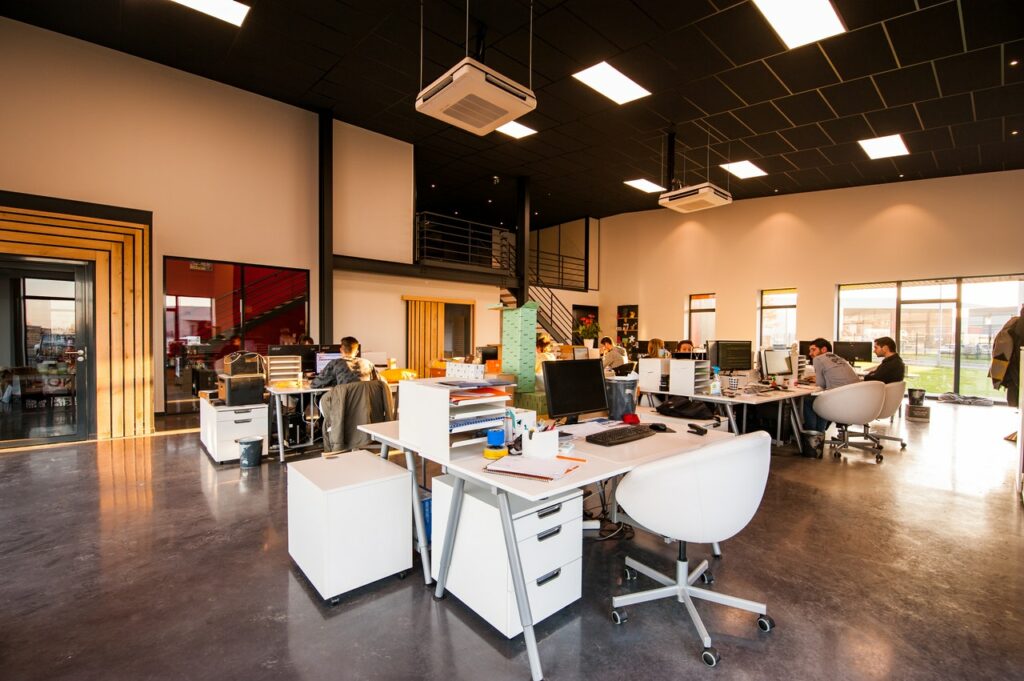
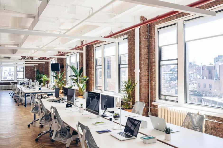
Design Strategies for Open-Plan and Private Offices
Open-plan offices present unique challenges and opportunities for applying office buildout color psychology. In these environments, color can be used to define zones, reduce visual clutter, and support different work styles. For example, using calming blues and greens in shared spaces can help minimize distractions, while brighter accents can highlight collaborative areas.
In private offices or meeting rooms, color choices can be tailored to the specific needs of the occupants. A leadership office might feature deep, confident tones, while a creative studio could benefit from stimulating shades like orange or yellow. For a deeper dive into designing open-plan spaces, see this comprehensive guide to open-plan office design.
Integrating Color with Other Workplace Design Elements
While color is a powerful tool, it works best when integrated with other aspects of office design. Elements such as furniture, lighting, acoustics, and layout all contribute to the overall atmosphere. For instance, pairing a calming color palette with ergonomic furniture and effective soundproofing can create a more comfortable and productive environment.
If privacy is a concern, consider reviewing office buildout soundproofing tips to complement your color strategy. Similarly, for spaces like conference rooms, thoughtful color choices can enhance focus and communication—explore the conference room design guide for more ideas.
Frequently Asked Questions
What colors are best for boosting productivity in the workplace?
Cool tones like blue and green are often recommended for areas where focus and productivity are important. These colors promote calmness and concentration, making them ideal for individual workstations and meeting rooms.
How can I use color to reduce stress in an office setting?
Incorporating calming hues such as soft greens and blues in relaxation zones or break areas can help lower stress levels. Avoid using overly bright or intense colors in spaces meant for unwinding.
Should brand colors be used throughout the entire office?
While it’s beneficial to reflect brand identity in the workplace, it’s not necessary to use brand colors everywhere. Instead, use them strategically—such as in reception areas or accent walls—while balancing with neutral tones for a harmonious environment.
How does lighting affect color perception in office spaces?
Lighting can significantly alter how colors appear. Natural light tends to make colors look more vibrant, while artificial lighting can add warmth or coolness. Always test color samples under different lighting conditions before finalizing your choices.
Can color psychology help with hybrid workspace design?
Absolutely. By selecting colors that support both focus and collaboration, you can create flexible environments suited for hybrid work models. For more insights, see the hybrid workspace design overview.

